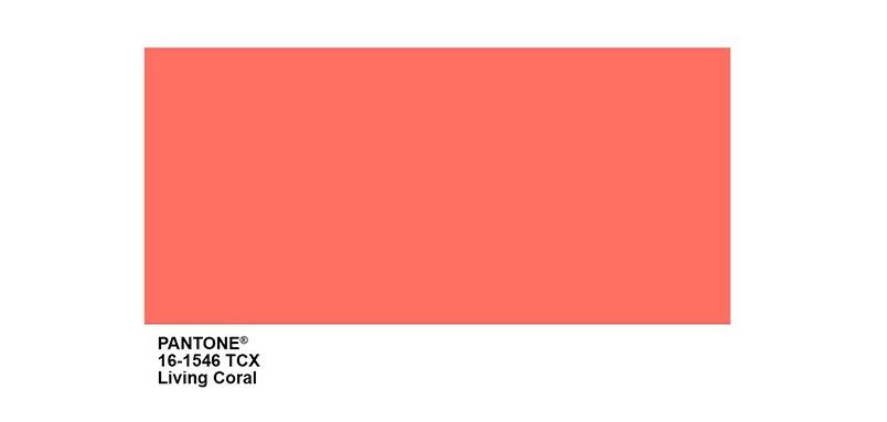
The Pantone Color Institute have announced their colour for 2019 – Living Coral. This gorgeous shade takes its inspiration from the coral reefs found in nature. Pantone calls it “An animating and life-affirming coral hue with a golden undertone that energizes and enlivens with a softer edge.” https://www.pantone.com/color-intelligence/color-of-the-year/color-of-the-year-2019
The Psychology of Colour
Research has shown that colour plays a huge part in people’s perceptions and mood on their interactions with products, with up to 90% of decisions based on colours first.*
Colour is an important element of making your promotional products work – how do you make your product appeal to your target audience? How do you choose colours to represent your brand? Check out The Ultimate Guide to Color Meanings from Color Psychology, which gives a more in-depth idea of what colours mean to people. Here’s a quick overview:
• Black: associated with sophistication, quality but also fear, sadness, and death.
• White: associated with innocence, purity and cleanliness.
• Red: associated with strength and love, but also danger.
• Yellow: associated with warmth, energy and happiness.
• Orange: associated with happiness and positive motivation and enthusiasm.
• Blue: associated with trust and authenticity.
• Green: associated with nature, growth, and health.
• Purple: associated with wisdom, royalty and luxury.
• Pink: associated with romance, optimism and kindness.
Choosing colours for your marketing
When it comes to using colour for your promotional merchandise, have a think about the following:
– What kind of feeling do you want your brand to portray? Whatever colour you choose, use it consistently so your customers associate it with your brand personality.
– Do you have a specific pantone colour for your brand? There are many products that can be pantone matched to get the exact colour you need.
– Want your product to stand out? Ensure your print design complements with your product colour choice. Contrasting colours work best i.e. black on white.
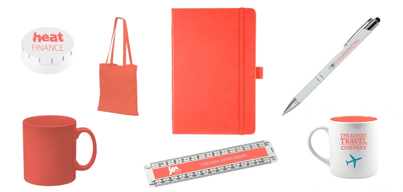
If you love 2019’s new pantone, bring it into your artwork or promotional product – here is a little inspiration:
*Impact of Colour on Marketing Satyendra Singh